Visualizing The DotA 2 The International Metas
In this blog post, I will do very basic visualizations of various matches from previous “The International” tournaments of DotA 2. DotA 2 is a video game by Valve. In this game, two teams compete in a virtual arena over objectives until one wins. “The International” is a tournament held every year by Valve, and it is arguably the most important and largest tournament of the scene.
DotA 2 typically at any time will typically have standard strategies that each team will execute, with some strategies of course being better than others. This set of dominating strategies is called the meta of that period, or the current meta if we are looking at current time. After each International and throughout the year after, IceFrog, the most visible game designer or DotA 2, will implement changes to make the game more fair and to add reasonable novelty. These changes result in the meta evolving.
Main Question: I was curious if one could visually inspect the different matches of the Internationals and find discernible patterns. The rest of the article focuses on how this was done. If you are interested in exactly what I did (as I will mostly describe high level details below), feel free to check it out on Github.
By the end of this post, you will be superficially familar with some of the most effective dimensionality reduction techniques. You can use the references to dig up on the more interesting details.
Data Collection
The following section is very DotA 2 specific, so if you are not too familiar, feel free to skim.
I wanted to visually inspect the meta of each of the previous Internationals, and thus, I collected data for all the matches in International 5, International 6, International 7, and International 8 via the OpenDota API. I was having a hard time finding data for the matches in the first International. Some of the information I thought would be valuable was not present in the match data for Internationals 2, 3, and 4, so I ignore these. After collecting all the matches, I extracted certain things that I thought would be representative of the data.
Some things I extracted were the hero compositions of the team, the ban and pick timings, and some stats on the game like hero damage, sentries placed, and others. I wanted to capture item information, objective timings, building status, but then I got tired (sorry). Of course, these leads to a large amount of data points for each match (about 270). It is implausible to visualize this as humans typically have capacity to visualize things up to a 3D space (including 1D and 2D objects of course).
The Math Behind Visualization
This part is more directed towards machine learning enthusiasts. The following concepts will be at an intermediate to advanced level for those practicing data science. The techniques that worked best on the DotA 2 match data are on the advanced level of difficulty.
So how does one visualize a particular match or instance in a 2D or 3D space when each instance is highly dimensional? There is a set of techniques in machine learning and data science specifically for reducing the dimensions of set of objects to a number of dimensions that is more reasonable to visualize or feed into a separate model. Aptly called, these techniques are dimensionality reduction techniques. Some dimensionally reduction techniques can make use of “class label”, which would make them semi-supervised or supervised. Unsupervised techniques would run on all the matches’ data points, except we do not tell the algorithm which “The International” the match is from. Below I will describe some of the techniques I used.
It is also important to note that I transformed the data obtained above using standard machine learning techniques such as OneHotEncoding and StandardScaling. It will be useful to describe the original space as the original data. The embedding space or projections will be the data after it is reduced to fewer dimensions. For all of the algorithms except SELF, I did not do standard train-test splitting. I just transformed all the data and then visualized it.
Unsupervised Techniques
Principal Component Analysis (PCA) uses the covariance matrix of (typically) centered data to find eigenvectors that capture the most variance (hopefully information) of the data. Once you have the number of eigenvectors that captures a certain threshold of the data (or just a minimum number determined another way), you can apply a change of basis using the orthogonalized eigenvectors.
Kernel PCA is basically PCA, but it uses the data in a higher dimensional space. This higher dimensional space might be infinite (which is the case for us since we use the radial basis function as our kernel), so you never actually calculate the eigenvectors but instead just calculate the dimensionally reduced data via the kernel trick.
ISOMAP is a technique that computes the nearest neighbors for each point. From this you compute a neighborhood graph with the distances being the edge length. After that, you extend the graph by running a shortest path algorithm to find the distance between two points that were not neighbors in the initial graph. After the graph is completed, you then apply classical multidimensional scaling, which reduces to kernel PCA.
Locally Linear Embedding tries to find weights in the original data space that lets you reconstruct a particular point given its neighbors. Using these weights, it then optimizes a projection in a reduced space, such that the projection of a point can still be reconstructed by using the projection of the neighbors (where the original paper suggests an L2-norm).
T-Stochastic Neighbor Embedding (T-SNE) is a technique that tries to find a new distribution for the data that seems similar to the actual distribution. However, if your algorithm depends on some property of the geometry or distribution in the original space, you should probably not use T-SNE. T-SNE also has issues reducing to dimensions greater than 3 because of the properties of the t-distribution. The T comes from the fact that the T-SNE uses a T-Distribution to model data in the embedding space, whereas the original SNE algorithm did not. The T-distribution adds properties like easier to optimize and better scaled attractive forces between a cluster that might be separated out.
Uniform Manifold Approximation and Projection is a technique that learns manifold embeddings much like T-SNE and LLE, but it does so for each point. And then it uses fuzzy set theory and topological data analysis to make unify the local approximations into something for the whole dataset. The paper is really hard to read if you don’t know algebraic topology and category theory, so I suggest reading the paper with the code handy (this is also useful to notice imlementation differences from the original paper, such as using interpolating between fuzzy unions and intersections instead of just fuzzy unions). UMAP has an advantage over T-SNE that it can be used for things beyond visualization for highly dimensional data, but it does place a few more constraints. UMAP can also be ran in a semi-supervised or supervised manner, but it is usually introduced as unsupervised. It requires some tuning of hyperparameters, and it might take mulitple runs sometimes to get something interesting. It is VERY fast. Leland McInnes, one of the original authors, is also very nice and helpful on Twitter.
Supervised Techniques
Linear Discriminant Analysis (Fisher Discriminant Analysis) tries to find a linear transformation that optimizes variance between classes and minimizes variance within classes in the projected space. Because of the structure of the scatter matrices, the maximum number of components that you can extract is the number of classes - 1. Since we are analyzing 4 different Internationals, the maximum number of components that we can reduce to is 3. However, in accordance with how we did the rest of the models, I choose to reduce to 2 components.
Largest Margin Nearest Neighbors (LMNN) is a technique that tries to make sure that the nearest neighbors of a point in the projected space belong to the same class (same International), and attempts to put all the points belonging to other classes in a far away place. LMNN is very nice because it leads to a semidefinite convex program (these have nice properties). This is contrast to UMAP and T-SNE.
Semi-Supervised Local Fisher Discriminant Analysis (SELF) is a combination of a modified version of LDA and (unmodified) PCA. Because of the construction, the maximum number of components is not limited by the number of classes. There is also a guaranteed solution because of the smooth bridging with PCA. This is important because the modified version of LDA that SELF is based on might not converge for some datasets (it did not for the DotA 2 data). I use SELF in a supervised manner, but you can give it both labelled and unlabelled points. The modified LDA runs on the points with class labels. The interpolation uses all the points. It uses a modified version of LDA to address multi-modality within classes.
All of the above techniques have Python implementations that can be easily found, with the exception of SELF. If you are interested, you can use my very inefficient implementation.
Results
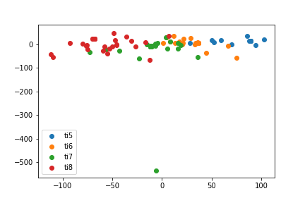
Here, we see the basic visualization results for each of the previous algorithms.
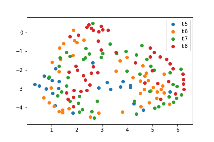
The most interesting thing is that the best performing algorithms show a visible transition of the meta, and this is most apparent in the SELF results. UMAP shows this as well, but it tends to mess up a little on the TI5 matches. Pretty much else everything else fails at finding something interesting. It could be that the other algorithms are picking something different than the meta such as play styles or evolution of matches.
Things of note:
T-SNE has an almost ring-like structure to it. With the later years on the outside mostly. TI5 and TI6 are almost treated interchangeably.
UMAP has a similar ring effect, but there is also a stronger demarcation from left to right. TI5 matches tend to be closer to TI6 and TI7 matches.
SELF has a nearly perfect line of the evolution of the metas. This effect remains even if I do stantard train test splits.
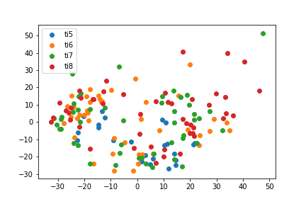
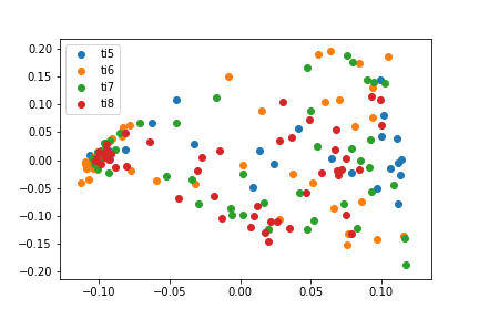
 PCA
PCA
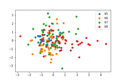
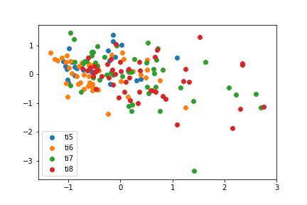
 KPCA
KPCA
 LDA
LDA
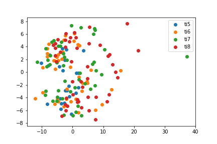
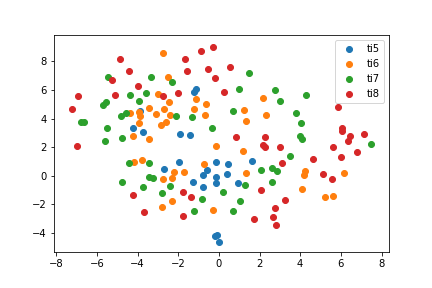
 ISOMAP
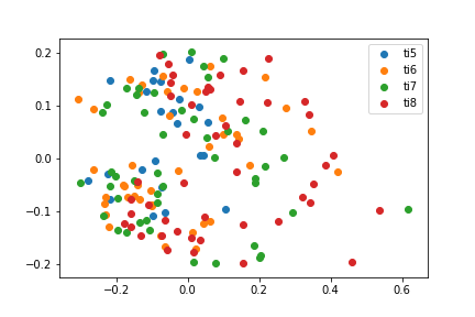
 Locally Linear Embedding
 Largest Margin Neast Neighbors
 T-SNE
T-SNE
 UMAP
UMAP
 SELF
SELF
One thing to note that this ranking of the performance of the algorithms is not universal. On another set of data, UMAP and SELF might be terrible!
Conclusion
It would be interesting to analyze deeper what the failure points of less visually appealing algorithms. It could also be the case that they are picking up different aspects of DotA beyond the meta like teams, shared players across the years, etc.
I also did not optimize each algorithm to its possibly best performance, as I re-used certain configurations (hyperparameters) across the models. It could be that some of the algorithms above should be ranked differently.
Nonetheless, dimensionality reduction techniques seem to be fruitful in capturing the meta for us in algorithms that might require fewer dimensions for tractability or better performance by some metric.
In addition, for all the algorithms (but especially the supervised ones), I did not evaluate generalization (except for SELF) by doing basic things like having a training set, (validation set), or test set. This is a really bad thing to do if I were trying to use these algorithms for a downstream purpose or for repeated dimensionality reduction.
References
- Andrew Ng Covering PCA
- Kernel PCA Paper
- ISOMAP
- Linear Discriminant Analysis
- Largest Margin Nearest Neighbors
- UMAP
- T-SNE
- Locally Linear Embedding
- SELF
PS: Sorry for the lack of updates. I applied to and have been in grad school since the last update. There will be a lot more this summer :) The next goal is to do some reinforcement learning (REPTILE) with video games.